What is instant swipe and how can it increase your revenue?

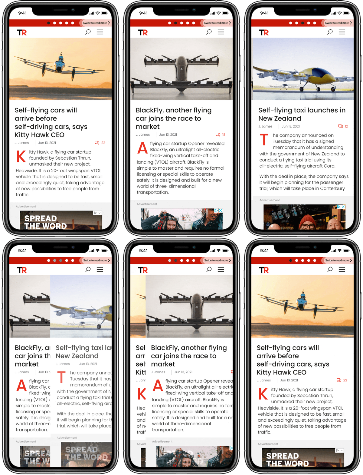
Instant swipe is a feature for simplifying mobile navigation of site pages. Using it does not require a reader to make any additional clicks. To go to the next article, users “turn” the page with a simple swipe of the finger across the screen, as if reading a magazine or book. In the meantime, visual elements of the interface make it clear that the swipe feature is active for the current page.

Reading the site becomes much more intuitive if you don’t have to go back to the category or the main page, or scroll through the content to find relevant articles. Swipe also supports smart selection with a customizable algorithm. Thus, the swipe selection may include the articles in chronological order, or the most popular ones, ones with the same tags, ones from the same category, etc.
Why use instant swipe?
We’ve already mentioned how much this feature improves navigation, but its usefulness goes far beyond that. Swipe is a great monetization tool. The logic is simple: easy navigation provides a high-quality user experience, it increases the number of page views and the average user time on the site. Therefore, ad views also increase.
Below is an example from one publisher using Prism, Clickio’s cloud-based mobile page template, which includes instant swipe as an option. Over a two week period, the publisher tested Prism, with swipe enabled, against their standard mobile site.
On Prism, they saw 16% of pageviews coming from the swipe feature. This, along with Prism’s fast page speed, helped to increase pages per session by 21% and average session duration by 10%. This in turn, led to a 26% increase in revenue, as measured by session RPM.
How to enable Instant Swipe on your site
The implementation of new features requires a certain technical background, and the swipe feature is no exception. The main difficulty is maintaining the correct page layout: trying not to break the template and not to move the ad away from its current place. Moreover, dynamic ad change (counting the views) is required when swiping, but only the content part of the page should be updated: the header, main menu and footer should remain intact. The so-called “dead zone” (a customizable area that allows you to avoid accidental clicks and swipes while scrolling) deserves special attention. Without it, navigation becomes overly sensitive and pushes the user away from reading after a couple of unintentional taps on the smartphone screen.
If implementing technically complex features isn’t your forte, then it could make sense to get Clickio Prism for your site. This cloud-based mobile template, which can be installed via a WordPress plugin or through integration with Clickio’s CDN, automatically creates fast-loading mobile-optimized pages with navigational features such as instant swipe and infinite scroll included. This, in turn, allows you to achieve the maximum results from each user session. User engagement increases in proportion to your revenue: on average, visitors spend 45% more time on the site, which provides a 59% increase in revenue (session RPM).
See what difference Prism could make to your site. Click here to set up a free A/B test, or contact us to find out more.
