How to avoid layout shifts on multi-size ads?

The adoption of multi-size ads continues to grow among both ad networks and publishers, as its dynamic nature drives good results in terms of ad revenues. However, despite ad optimization, the answer to how to minimize the layout shift with multi-size ads can be confusing and challenging for many publishers. In this blog post, we will discover what layout shift is and how it can be minimized on pages with multi-size ads.
Summary
- What is layout shift and what causes it?
- How to measure layout shift?
- How to minimize layout shift with multi-size ads?
- Minimizing layout shift with multi-size ads with Clickio Prism
What is layout shift and what causes it?
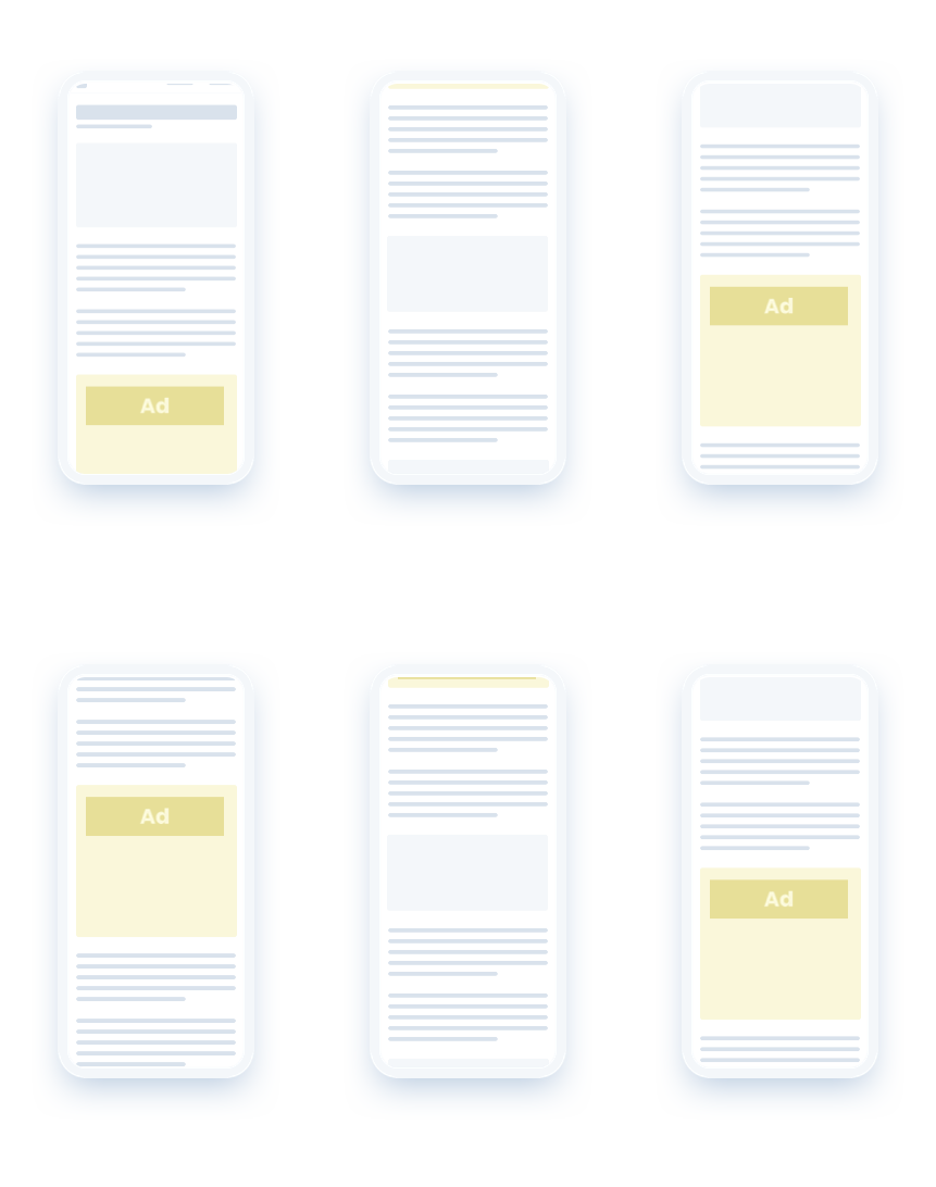
Layout shift is a movement of content on the page without user intention or prior notification (e.g., text that moves up and down the page or a link that changes its position while the user is trying to click on it). Unpredicted jumps of the content that occur when a user navigates a website may cause confusion and frustration, which eventually leads to poor user experience and losing readers’ loyalty. Moreover, layout shifts may lead to accidental clicks that negatively impact monetization outcomes.
Layout instability can be caused by asynchronously loaded elements present on the site or the elements that are dynamically added to the page above currently viewed content. In practice, it can be caused by the elements (for example, images or video) without explicitly set dimensions, wrong use of fonts, but more frequently by the third-party ads that are dynamically added or resized, also known as multi-size ads.
How to measure layout shift?
In May 2020, Google introduced a set of metrics, called Core Web Vitals, to evaluate whether or not a website provides a good user experience. In particular, the metrics measure the three main dimensions of user experience, such as loading time, interactivity, and visual stability. One of the metrics, the Cumulative Layout Shift (CLS), specifically addresses the issue of the layout instability and measures, in simple words, how often and how big shifts occur for the end-users.
Cumulative Layout Shift can be measured using all the main Google web developer tools, including Lighthouse, PageSpeed Insights, Chrome DevTools, Search Console, web.dev’s measure tool, the Web Vitals Chrome extension, and the Chrome UX Report API.
CLS ranges from 0 (no shifts) to 1 (maximum shifts). According to Google, a site provides a good user experience if its CLS is lower than 0.1
Source: web.dev – https://web.dev/cls/
How to minimize layout shift with multi-size ads?
As mentioned above, one of the most frequent reasons for layout shifts is the dynamic nature of ads. Multi-size ads (ads that support different sizes of creatives), despite causing some layout shift, on average perform better than fixed-size ads.
The main reason for the shifts to occur on pages with multi-size ads is its asynchronous loading and insufficient reserved space for ads. To solve this issue, one option may be to reserve the space for the most frequent sizes to appear, according to the historical data from Google Ad Manager reporting; or to reserve the space for the largest possible sizes of the ads to be served. However, both methods bring the risk of having blank spaces if the smaller creatives serve in this slot. Blank spaces around smaller ads will drive poor user experience and low viewability, which may eventually impact monetization outcomes.
Minimizing layout shift with multi-size ads with Clickio Prism
To mitigate the problem of low viewability and poor user experience on pages with multi-size ads, Clickio have developed a feature called Mini-sticky. This vastly decreases the layout shifts without affecting the monetization outcomes.
By fixing the size of the ad slot, creatives of smaller size move within the ad slot while the user scrolls the page, remaining visible for more time. This can lead to higher conversion rates and improves the user experience.

It was proven that the Mini-sticky feature decreases the layout shifts by related multi-size ads by over 90%. As an additional bonus, it increases viewability.
Mini-sticky feature is available for all Clickio publishers on Prism, a technology that transforms any content site into a progressive web app, making it faster, interactive, and more stable.
If you would like to know more about how to minimize layout shifts with Mini-sticky on Prism, please don’t hesitate to contact the Clickio team.
