How to maximize revenue with mobile stickies

As explained previously, sticky banner ads can help to increase the viewability of your ads and maximize revenue from your site.
One of the most popular forms of sticky banner ads among Clickio publishers is the mobile sticky. This can be used at the top or bottom of the screen, or even in both positions – so which is the best setup for publishers to use?
According to our latest tests, mobile stickies are likely to be most effective with a 320×50 banner at the bottom of the screen and a 320×50 banner at the top, with a short pinning when scrolling. This is demonstrated in the image below:
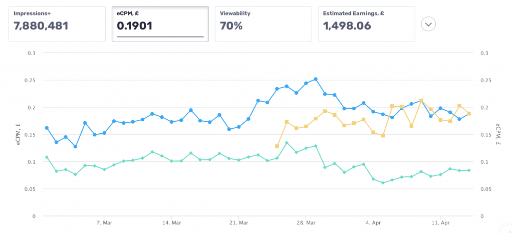
For example, the screenshot below shows data for one Clickio publisher, originally using a 320×100 sticky banner at the bottom of the screen. Subsequently, the bottom sticky banner was reduced to a height of 50, then a second 320×50 block was added on top and fixed only for a couple of seconds and collapsed when scrolling. These were used along with a smart banner appearing within the content of the page.
Legend
Bottom sticky 320х50
Banner in the header 320х50
Smart banner in the content 336х280

The screenshot shows that after installing the upper banner and reducing the size of the lower sticky from 320×100 to 320×50, its CPM decreased slightly, but the CPM of the upper block was initially much higher. In fact, the total income for two 320×50 banners was about 50% higher compared to using the one 320×100 banner, even though the user sees a banner twice as small. At the same time, the installation of an additional ad unit did not have a negative impact on the CPM of the existing smart banner within the content.
This solution is already available for sites using Clickio Prism technology and will become available for other Clickio publishers soon.
Alternatively, if you have a menu bar fixed for some time when scrolling on mobile devices, you can put a banner there, thereby achieving the same effect. In addition, you can simply replace the lower 320×100 sticky banner with two 320×50 banners (top and bottom). From a revenue perspective, it is likely to be even more profitable than the option described above, but a little worse for user experience.
Of course, the optimal ad settings are likely to be different for each site, so it’s important to test what works for yours. Clickio’s AI-powered platform constantly tests a variety of ad layouts, placements and settings to find the most profitable combinations.
To start using Clickio ads on your site, register here. Or contact us to discuss how to improve your ad setup.
